Saturday, March 21, 2020

Website

 Hi! I started looking at some website templates using Wix and I found 2 very simple ones that seem very easy to navigate and have the very clean and slick look I am looking for. 
  This first one was under the “blog” section but I think I can edit the tabs enough to make it an interactive website for the documentary. As you scroll down the template you can see “recent posts” which I was thinking could be a good place to put featured videos or pictures and behind the scenes footage. There is not much to say about this template since it is very simple and easy to look through. Honestly, that is what drove me to it because I do not want a chaotic website. 
  The second one is just as simple but it seems to stick more to a color palette, mainly through the pictures, which I really liked. I do like how the first thing you see is a big picture, which I was thinking is where I could place the group photo with the title. It is a good way to draw attention and a personal way to introduce the cast and the documentary. 

   Choosing between the 2 will be hard simply because they are so similar. I honestly won’t be able to do much until I can get more footage but having the website done and only needing to add photos and videos will be much easier. 

Friday, March 20, 2020

Fonts

       If you are not a newbie to my blogs then you know the trouble I went through last year with my magazine regarding fonts. It was such a struggle because my partners and I wanted a very specific font that resembled that of VOGUE magazine. Lucky for me, this year I am looking for a simplistic font that is between a playful and mature look. I talked about fonts a little bit a couple posts ago when I analyzed some posters, but I have been digging around dafont.com for some simple fonts and these are the three that intrigued me the most.
This one is called “Futuristic Fixed”:
What I liked about it is that the font is frankly quite basic but the spacing is what gives it some dimension and it will take up a good amount of space in the poster without being chunky. I want the title to be quite large but not chunky, I hate chunky fonts when the title is more than one word, it looks awkward. 

The second one is called “Monofonto”:
This one is a little bit chunkier, but not extremely bold. The spacing is normal and for some reason when I saw it I thought “modern typewriter”, don’t ask me why but that is the vibe I got from the font. I like that it's bolded but not in an obnoxious way. This might look better than the first one when it is put over the green (grass) of the photos (if it goes as planned). 

The last font is called “Vera MoBd”:
I know what you are thinking-- this is the same font as the second one. This might be me being absolutely insane and a perfectionist about this, but they are not the same. The “e” and “s” are thicker and more elongated, which to me makes the title more aligned and proportional. The difference is extremely small but I did notice a difference.

Thursday, March 19, 2020

Production has been put on hold


 Hi! Welcome back to yet another chaotic blog post in which I go on and on about everything that the coronavirus has ruined for us, including my project. The good news is that my instructor, Mrs. Stoklosa has new plans and tips to help us out since it is quite tricky to get critiques when we cannot meet, or well film anything at all. We had an online meeting as a class in which Mrs.Stoklosa presented new updates about COVID-19 and how it would affect the school as a whole and then more specifically our projects. Social distancing and quarantine are highly important right now, but sadly that ruins my project. I spoke with my subjects’ parents and my interviewees and told them to NOT worry and to not go out of their comfort zone to help me because it would just be inhumane to beg them to come film and also do the photoshoot. Everyone is very understanding and we are all waiting it out at least until my spring break is over. We are hoping that by then things will be better (not totally resolved obviously) enough so that they feel good and comfortable about coming to my house to film interviews/ other footage for the website and to do the photoshoot in the park. Like I have mentioned in previous posts, most of my subjects have had surgeries regarding health problems so the last thing I should be is insensitive. As much as I care about my piece and really want to deliver the message I wanted to, I don’t want to put anyone’s life at risk. From now on, my posts will mainly be updates on website design, fonts, and distribution, but I do not know for sure when I will be able to gather the footage I still need. Lucky for me, the footage I needed of Vera coming off the school bus and playing with the dogs is all done. I hope you all understand our struggles (speaking for all A level Media students) and also you can expect great projects because we are such creative students we will all come up with something amazing.

Friday, March 13, 2020

Coronavirus is ruining my project


 I truly thought I had encountered the worst setback when realizing how hard it was going to be working around dogs and my stubborn sister, but I was wrong because I obviously cannot control what goes on in the world. I had planned to do the photoshoot and the videos for the website during spring break since that is when all my other subjects are free and don’t have school. Sadly, the coronavirus had other things planned for me. Not only is school canceled for another week but everyone is self-quarantined (at least from really crowded public spaces). This basically ruined my entire project so far. The 2 public events I was going to film, my subjects didn’t even go (understandably so), and the dog beach now has stricter hours and it is basically empty so that is also ruined for now. In order to not completely fall back on this project I am taking this week to build the website, find fonts for the poster, and also get the interviews out of the way so that I at least have that done and whenever this situation calms down, I will have to find a way to get the photos and videos before the deadline. 

Thursday, March 12, 2020

Streaming

Welcome back! Today I am going to talk a little bit about where/ how I want my documentary to be distributed. After sitting down and looking at past projects and also talking with my instructor, I quickly realized streaming services such as Netflix or Hulu is the way to go. From personal experience, there are many households, especially teens, that only rely on streaming services for their entertainment. I personally use Netflix and Hulu the most, especially when searching for a new documentary to watch. After reading some quick comparisons between Netflix and Hulu, I decided I want to make “This Is Me” a Netflix original. The only good docuseries I have seen through Hulu are not originals. Overall, Hulu is more of a hassle and not as appealing since it has ads and fewer selection of media. Netflix is PACKED with original docuseries, and even though most of them are about crime or suspense, I think that is what would make mine stand out the most since it would be such a contrast and very different from what Netflix is already producing. 

   I also have to think about this when I’m creating the poster. Mrs. Stoklosa showed me a student sample that had the Netflix logo on it, as all Netflix originals have. I did not have this in mind when deciding on what to do for my poster. Even though it is not a big deal just adding a logo, now I have to make sure that my previous idea with manipulating color might have to change. Having each subject wear different colored clothes and then have the bright red logo in the middle is simply asking for a busy and messy photo. I am going to stick to the outside as the background and then have all my subjects wear white that way the brightness of the white hopefully will take over the red logo. I will also make sure that the title (if I decide to make it any color besides black) matches with the background and the red. I know it seems a bit exaggerated to worry so much about a poster, but that is what will attract most viewers into watching the docuseries because in a streaming service, that is the first thing you see. 

Wednesday, March 11, 2020

I finally have a title!

Hi! So despite the many setbacks I have been facing and continue to face, I finally decided on a name for my documentary! I decided to talk to my instructor, Mrs. Stoklosa, about it because I really wanted to name it “This Is Us” but I didn’t know if that was allowed since there is already a TV Show with that name. She told me although it is allowed, it would not benefit the documentary since that TV show is so popular and the name would only correlate with that. So after talking to her and getting her input, she gave me the idea of “This Is Me”. I loved it because like she explained to me: even though my documentary contains multiple subjects, in a way, I am telling their individual stories. Something else that convinced me instantly is that it is simple, meaningful, and straight forward, just how I wanted it. 

  I know this blog post was very short but with this coronavirus mess, I can’t schedule any outdoor photoshoot or shoot videos of my subjects until we know more about the situation. 

Tuesday, March 10, 2020

Setbacks Continue

Hi! I finally was able to shoot some b-roll for the documentary but of course something had to go wrong. The weather was looking perfect: great light, no sign of rain. A couple minutes before Vera got home from school it started drizzling and everything good disappeared. I decided to still film because like I mentioned on previous blogs I am extremely busy and finding time to film this scenario is limited. When I chose this topic for the documentary I knew my subjects were going to be difficult to work with. First off, Vera gets frustrated when her schedule is messed with or when things don’t go her way. Also let’s not forget she is my sister so I knew working with her was going to mean her stubborn side was really going to show through. My other subjects for the b-roll are dogs. Yes, some are trained and they are great listeners, but when I am trying to film 3 dogs separately and together, AND the way they each interact with Vera, things get frustrating. Before inserting any videos I took today as sneak peaks I have to go through them because I already know I have to cut out a lot of the footage. I know the lighting and coloring will be easy to fix but I am going to try and film again when the weather is truly better, which is also something tricky since I cannot control my setting. 
   Another setback has been brought to me all thanks to the coronavirus. I was going to film at a social/dance that the City of Weston is hosting this friday. Vera and her friends were going and I thought it was the perfect opportunity to get footage for the website, but no, the coronavirus has everyone freaked out and none of them are attending the event anymore. There are still some events, such as a Best Buddies walk, that they might still go to and I can go as well to film, but due to this outbreak, nothing is set yet. I am really frustrated about that because these events were the perfect opportunity to get extra footage for certain features of the website but I will have to keep hoping nothing gets cancelled and more events come up that I can get the footage from. The photoshoot is still happening because that does not bring as big of a risk. Once again scheduling is giving me so many issues but I am figuring it out. At least I am pretty happy with the amount of b-roll I gathered today and I truly think I have plenty to work with. 
  -Talk to you on my next post!

Saturday, March 7, 2020

Setbacks

Hi! It has come to that point in the project where I am running into problems. This week I was SET on filming b-roll after school and at the dog beach. I had everything planned and was going to use my phone to film so nothing would go wrong with the equipment. During the week, I had a commitment every day after school and I would not make it on time to catch my sister coming home and getting the dogs. I was filled with frustration all week because I had a whole plan. Then at the dog beach it was INSANELY windy. It is only open weekends from 4-8pm so it gets colder and windier at the time. The lighting is always great (I always take pictures) and again, I had everything planned. Once we got there, it was barely enjoyable due to all the wind and it was impossible to get a good shot; the sound was horrible and Vera was also not like she usually is because it was cold and windy. 
    The good thing about this setback is that this week I actually have one new filming opportunity. I also checked the weather for this weekend to try again at the dog beach and it looks promising! It might be cloudy but it should not be as windy. Also, we have to take Linda ( our dog) to get a bath so we decided that one day after school instead of playing with the dogs, Vera will come with us and help us get Linda to PetSupermarket where there is a washing station for dogs. I want to have that footage just in case. Even though that is not a daily occurrence, I want to show what happens when there is a change of plans and how it HAS to include Linda otherwise Vera won’t want to do it. 

     I am also going to have a new opportunity on Friday to get extra footage for the website. There is an event at the City of Weston and Vera and her friends are going. It is the perfect chance to get any “behind the scenes” or “never before seen” footage to add to the website (which is a common thing to have for this type of production). Scheduling interviews has also been difficult since everyone has busy lives, but I am slowly but surely getting there. What matters right now is that this setback I had led me to more filming opportunities in a way.

Friday, March 6, 2020

Plan for Pictures

 Today’s post is going to be brief but very important. I am going to explain/ analyze some of my choices and ideas for the pictures that will be included on the website. 
  What I had in mind was something simple in terms of content, but the mise-en-scene elements of the photos is what will truly make them stand out and bring life to the website. My 2 ideas for the main group picture are: 1- a white background with the subjects wearing very colorful clothing. 2- a green (nature) background with the subjects wearing white. As for the poses, I want to capture the perfect candid one. I will try to make my subjects pose and get some staged photos (to have options) but my ultimate goal is getting a candid picture that shows each of their personality and also their interactions with each other. 
    This picture is my ultimate goal inspiration. I’m leaning more towards the nature option, but the idea is similar:
     The other pictures I want to have planned out are those that will go under the “Meet the Cast” section. Even though I want these to look more professional and posed, I still want to capture personality. They will give a headshot-like feel, but less professional. My plan is to set up the picture as a medium/close-up shot with either the same nature background or a colored wall, but I will give my subjects the freedom of choosing how they pose. I am taking control of the composition of the photo but they are kids and young teens after all and I want them to have fun and also show their personality through the camera so I deliver the most real as possible. 

  Here are some inspiration pictures/ examples:

Thursday, March 5, 2020

Website Inspo

 Hi, welcome back to yet another post. So today I looked at some website samples for the shows I used as inspiration and I found some things I want to make sure I include and others that I honestly disliked a lot and I want to analyze them and make sure I don’t make the mistake of including them. 
   First off we have the website for The Specials:
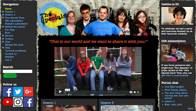
My first impression was that it is way too busy and not aesthetically pleasing at all (this makes the audience not want or know how to navigate it. The color scheme simply does not match at all and it makes everything look very harsh, which causes an unapproachable feel. I do like how the first thing you see is an introduction video. It is a great and easy way to introduce the show and the cast so the audience gets a good feel for it. The “Navigation” sidebar is very odd. Personally, I like the tabs to be on the top and there are also way too many tabs. Simply labeling “seasons” or “cast” and then having more tabs under that makes the website cleaner and even simpler to navigate. The tab to the right of the website has what I am assuming are updates or news but once again, it is very hard to understand the purpose and it is just simply not approachable at all. The “follow us” tab is bland and only has direct links. Although linking the sites is crucial, not personalizing it or making it look nice is not going to make people follow the accounts. There is also so much texture present on this site. The brick background, the ripped paper effect, and different colors makes the website not appear professional at all. Overall, this website only gave me examples as to what NOT to include. 
    On the other hand, the website for Born This Way gave me plenty of ideas.”
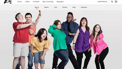
The website is technically the A&E network website, but their section for “Born This Way” is very easy to navigate, aesthetically pleasing, and overall great. I like how the website itself is white and black, very simple and sleek. The pops of color come from the pictures taken of the cast. The very first thing you see when you get to the website is a candid (and FULL of personality) picture of the cast, each of them wearing a different colored shirt, which creates a nice contrast and variation. The navigation tabs are at the top, and like I said previously, they are simple tabs that lead to more complex and detailed parts of the site. This is something I definitely have to keep in mind since I DO NOT want clutter. As you scroll down, there are more pictures included along with bits of information for the show such as “About the Series”, “Extras”, and “Meet the Cast”. Even though I feel like these are all necessary, the one I really want to make excellent is the “Meet the Cast” section. As I browsed the one for “Born This Way” I found that the pictures and the description themselves were full of personality and made me want to engage with the show even more since each cast member is so unique in their own way. I want to achieve some connection between the cast but I also want them to have their own individual moment of the spotlight since they will each technically have their own episode. 

So to conclude my decisions: I am getting most if not all my inspiration from the “Born This Way” website since it is exactly the aesthetic and theme I want to maintain throughout mine. Obviously, I will make sure to include as much personality as possible when including stuff about the cast. Other than that, stay tuned for the next post in which I will talk a little bit about what I have planned for the pictures!

Wednesday, March 4, 2020

Brainstorming Titles

  Hi! Welcome to today’s post. So I decided to dedicate today to brainstorming names for my documentary because even though the production is obviously important, the name basically makes it or breaks it. I want the name to be simplistic yet impactful. Here are some ideas I came up with. 
Brainstorming names:
-US
-This is Us (it is already a TV show but not a documentary)
- Who We Are 
-This is Who We Are

Honestly, my favorite one is “This Is Us” because it is something we say in my family a lot and I thought it would be a perfect match for my documentary topic but sadly there is already a TV show with that title. The second option I like is “US” because it is simple and straight-forward. The last 2 titles are not bad in my opinion but they are a little longer than I wanted it to be. 

I will most likely continue to come up with ideas along the way, but these are my top choices. 

CCR

Here is the link to my CCR: https://drive.google.com/file/d/15NyyG2aIaM_q3er-Vfu64TFto-mgsXd_/view?usp=sharing