Hi, welcome back to yet another post. So today I looked at some website samples for the shows I used as inspiration and I found some things I want to make sure I include and others that I honestly disliked a lot and I want to analyze them and make sure I don’t make the mistake of including them.
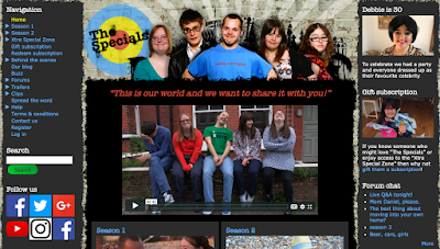
First off we have the website for “The Specials”:
My first impression was that it is way too busy and not aesthetically pleasing at all (this makes the audience not want or know how to navigate it. The color scheme simply does not match at all and it makes everything look very harsh, which causes an unapproachable feel. I do like how the first thing you see is an introduction video. It is a great and easy way to introduce the show and the cast so the audience gets a good feel for it. The “Navigation” sidebar is very odd. Personally, I like the tabs to be on the top and there are also way too many tabs. Simply labeling “seasons” or “cast” and then having more tabs under that makes the website cleaner and even simpler to navigate. The tab to the right of the website has what I am assuming are updates or news but once again, it is very hard to understand the purpose and it is just simply not approachable at all. The “follow us” tab is bland and only has direct links. Although linking the sites is crucial, not personalizing it or making it look nice is not going to make people follow the accounts. There is also so much texture present on this site. The brick background, the ripped paper effect, and different colors makes the website not appear professional at all. Overall, this website only gave me examples as to what NOT to include.
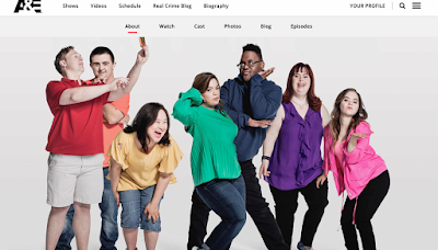
On the other hand, the website for “Born This Way” gave me plenty of ideas.”
The website is technically the A&E network website, but their section for “Born This Way” is very easy to navigate, aesthetically pleasing, and overall great. I like how the website itself is white and black, very simple and sleek. The pops of color come from the pictures taken of the cast. The very first thing you see when you get to the website is a candid (and FULL of personality) picture of the cast, each of them wearing a different colored shirt, which creates a nice contrast and variation. The navigation tabs are at the top, and like I said previously, they are simple tabs that lead to more complex and detailed parts of the site. This is something I definitely have to keep in mind since I DO NOT want clutter. As you scroll down, there are more pictures included along with bits of information for the show such as “About the Series”, “Extras”, and “Meet the Cast”. Even though I feel like these are all necessary, the one I really want to make excellent is the “Meet the Cast” section. As I browsed the one for “Born This Way” I found that the pictures and the description themselves were full of personality and made me want to engage with the show even more since each cast member is so unique in their own way. I want to achieve some connection between the cast but I also want them to have their own individual moment of the spotlight since they will each technically have their own episode.
So to conclude my decisions: I am getting most if not all my inspiration from the “Born This Way” website since it is exactly the aesthetic and theme I want to maintain throughout mine. Obviously, I will make sure to include as much personality as possible when including stuff about the cast. Other than that, stay tuned for the next post in which I will talk a little bit about what I have planned for the pictures!


No comments:
Post a Comment